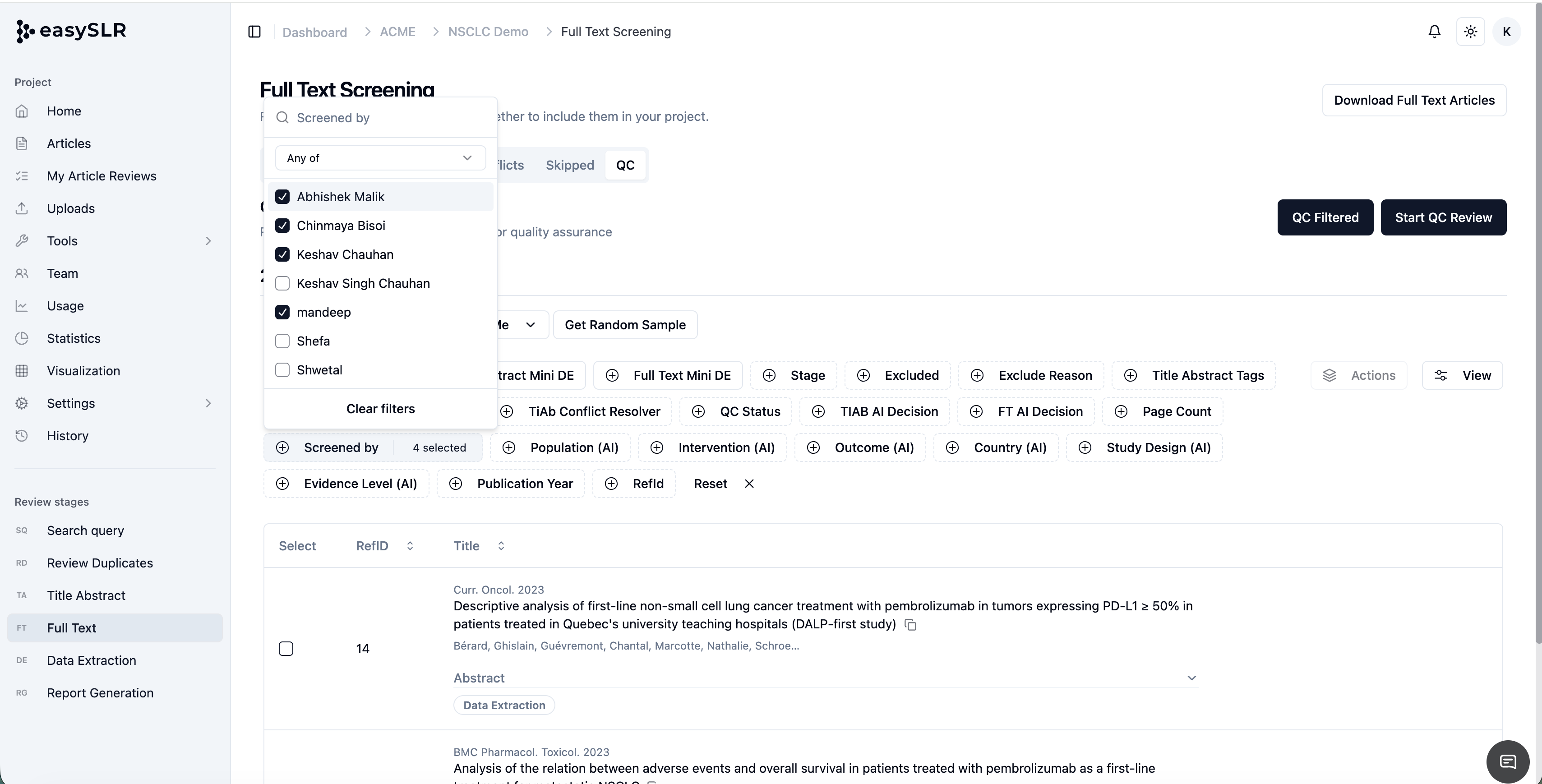
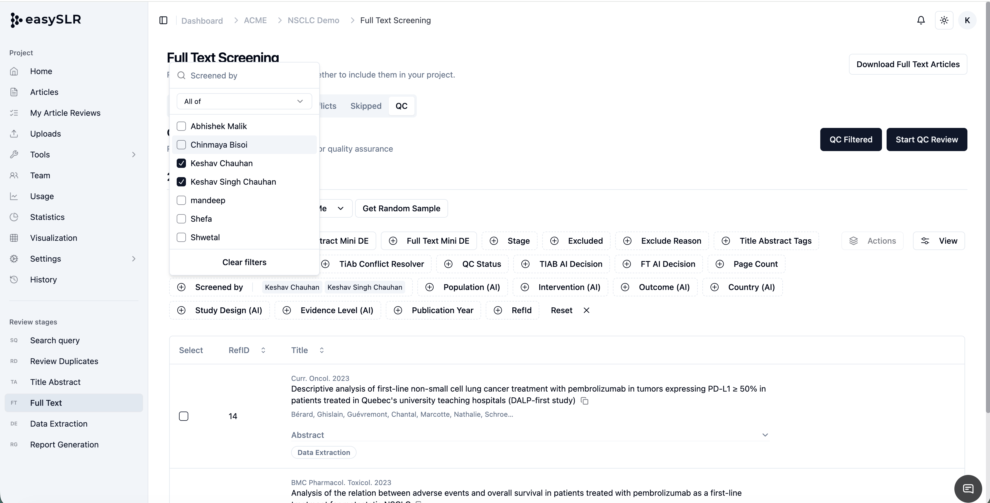
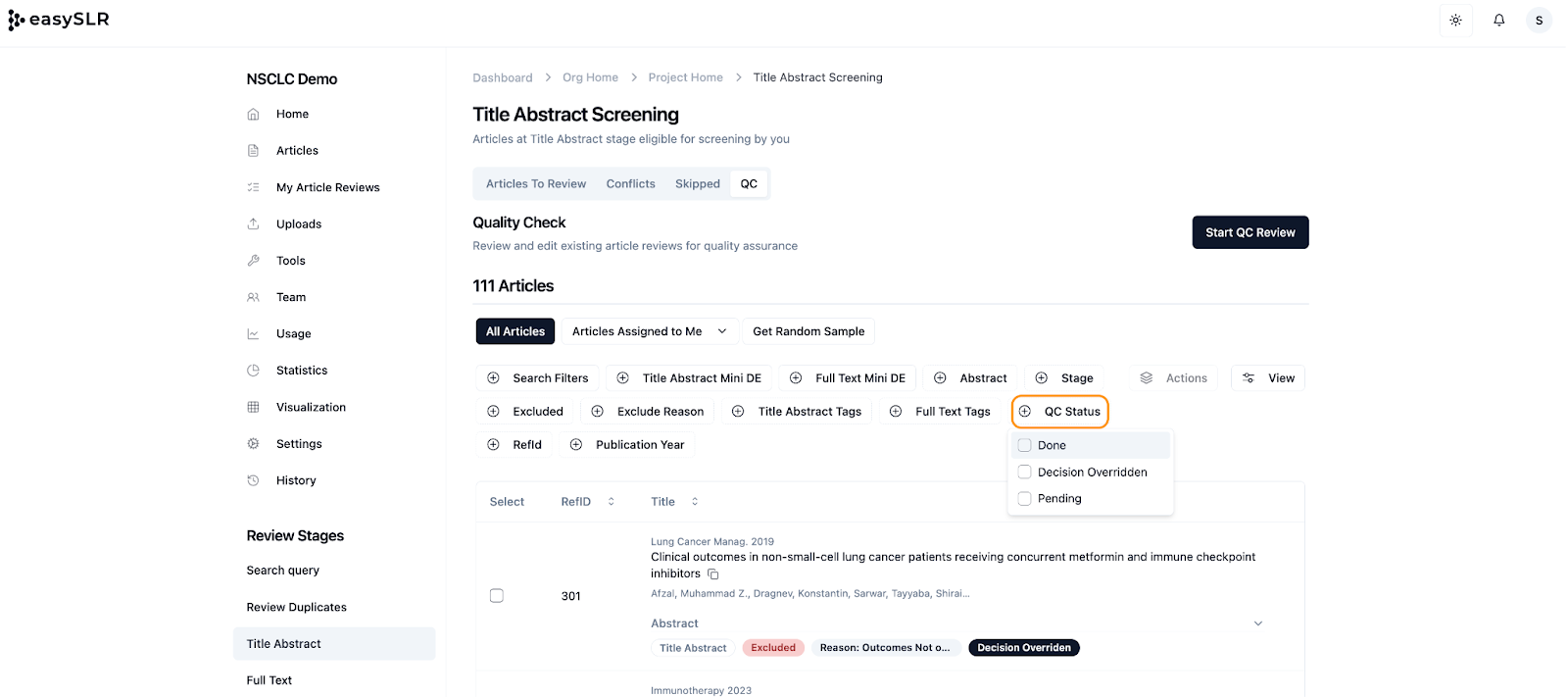
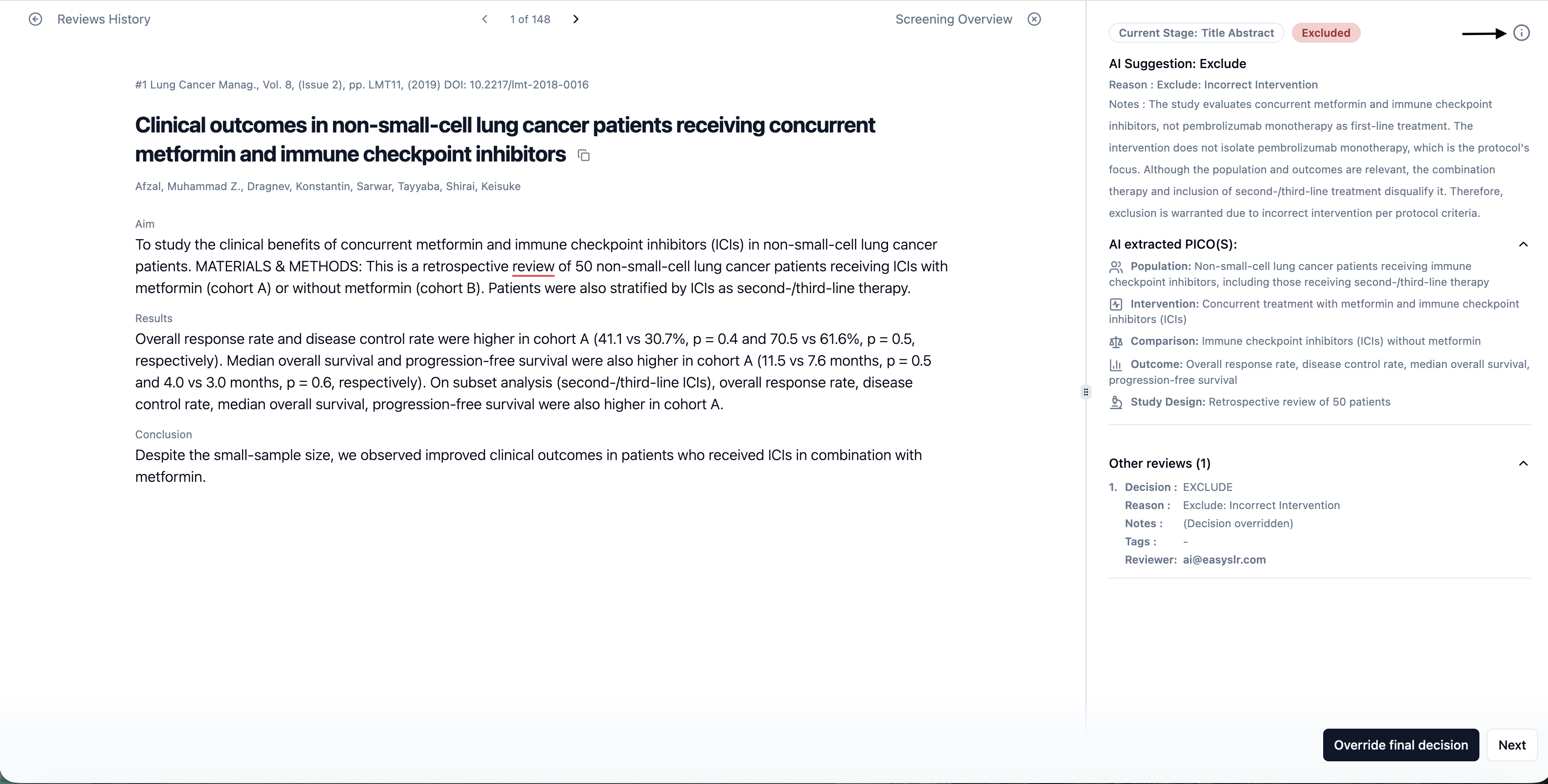
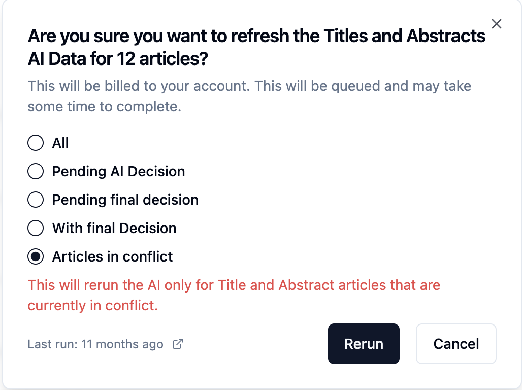
We've improved the AI Rerun workflow by introducing a new option to Run AI on Articles in Conflict. This addition gives reviewers another targeted way to rerun AI on records that require further assessment, helping teams resolve reviewer disagreements more efficiently.
Previously, AI could be rerun using several predefined selection criteria. With this update, Articles in Conflict has been added as an additional reason, allowing AI to specifically focus on records which are in conflicts.
What's New?
New AI Rerun Option: Articles in Conflict
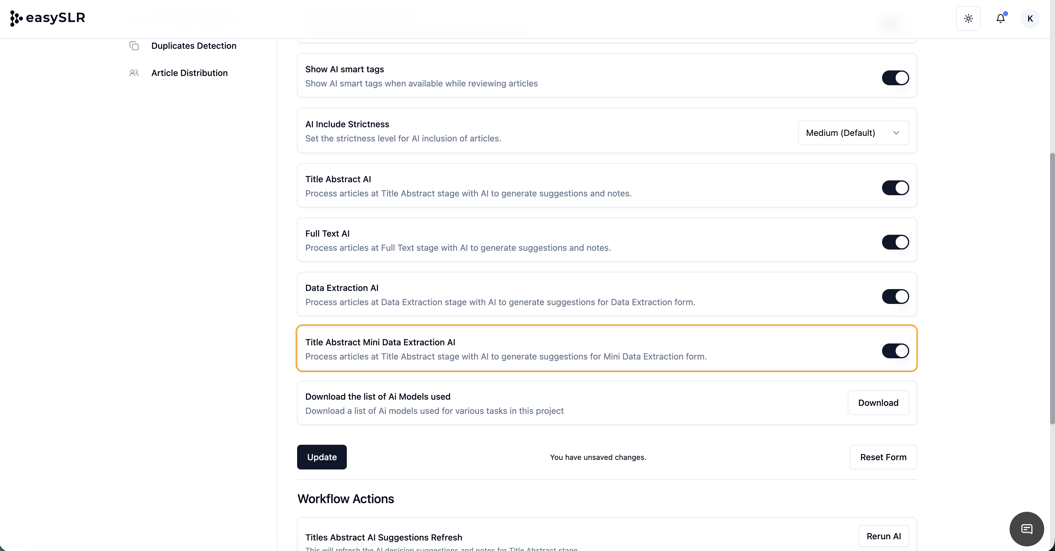
A new option has been added to the existing Run AI options.
Users can now choose to rerun AI specifically on articles that are currently In Conflict.
This enables AI to provide fresh suggestions and supporting rationale based on the latest changes made to the Protocol.
Why This Matters
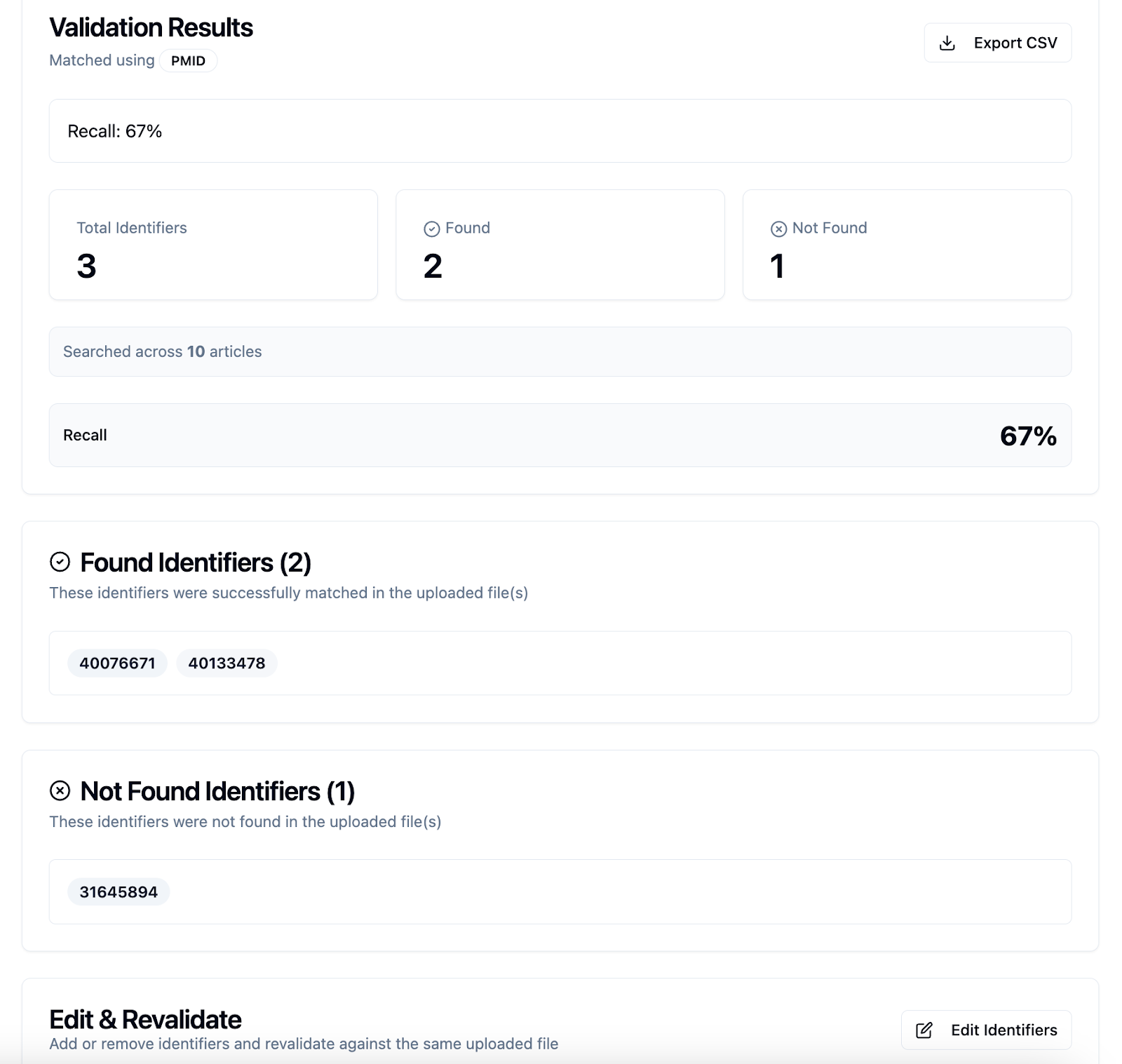
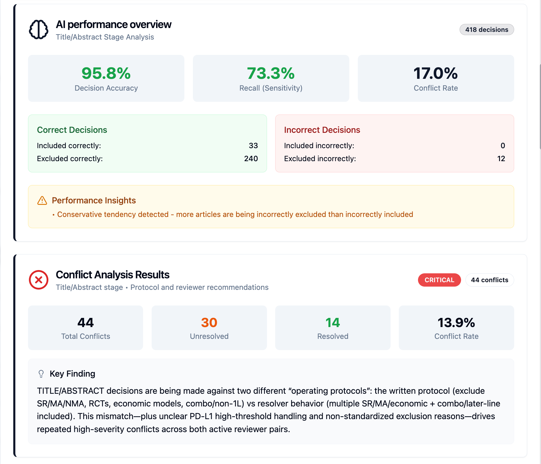
Conflicts are a natural part of systematic review workflows and often require additional evaluation before a final decision can be made.
Previously, there was no way to rerun AI on a selected set of articles if any amendments are made to Protocol to align AI and human reviewer decisions.
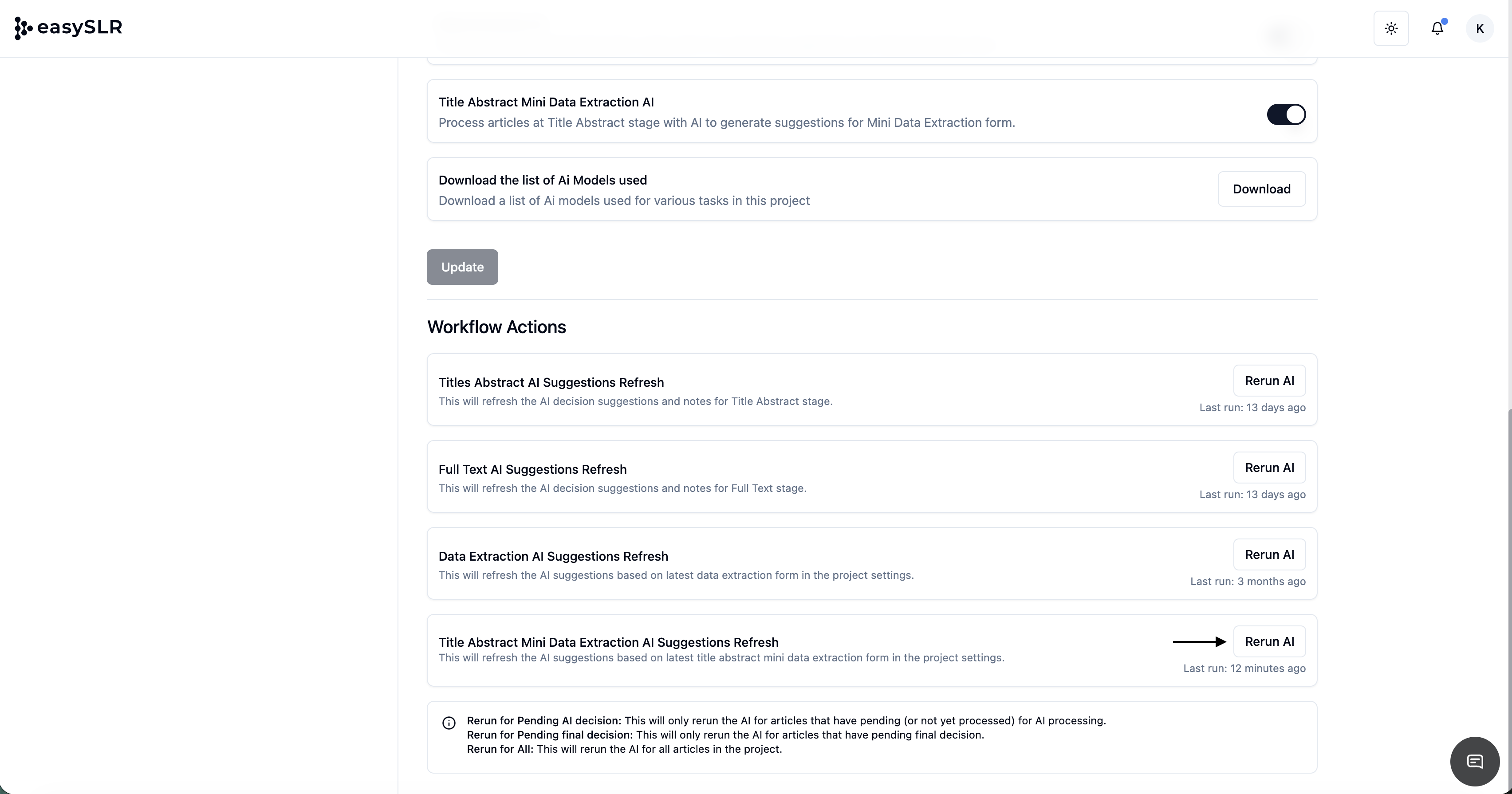
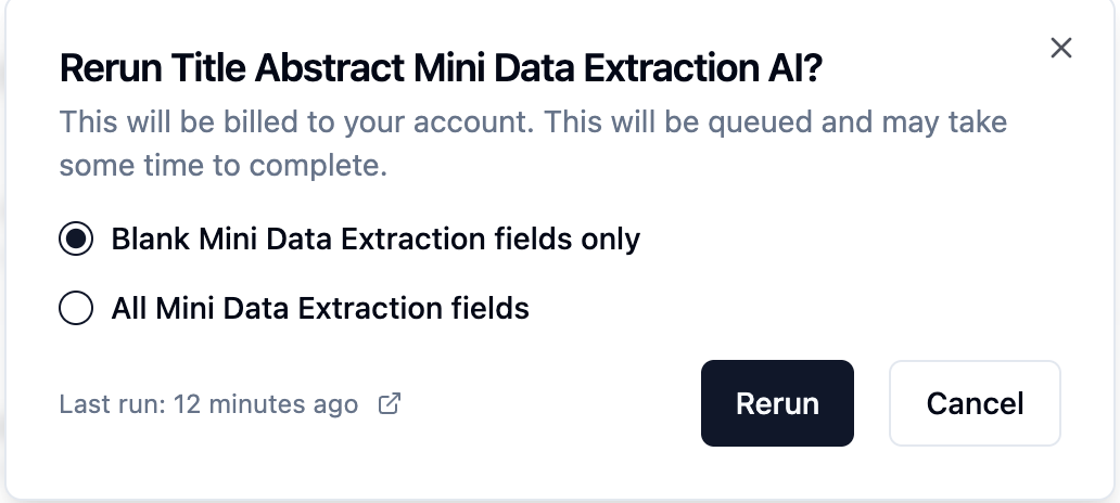
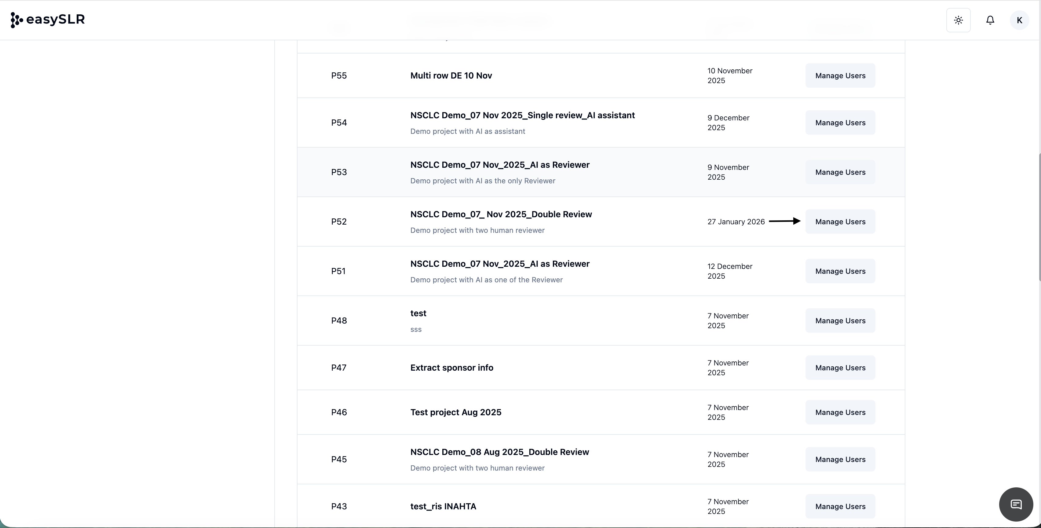
With this update when Run AI on Articles in Conflict is selected, EasySLR automatically processes only those records which are currently in conflict.
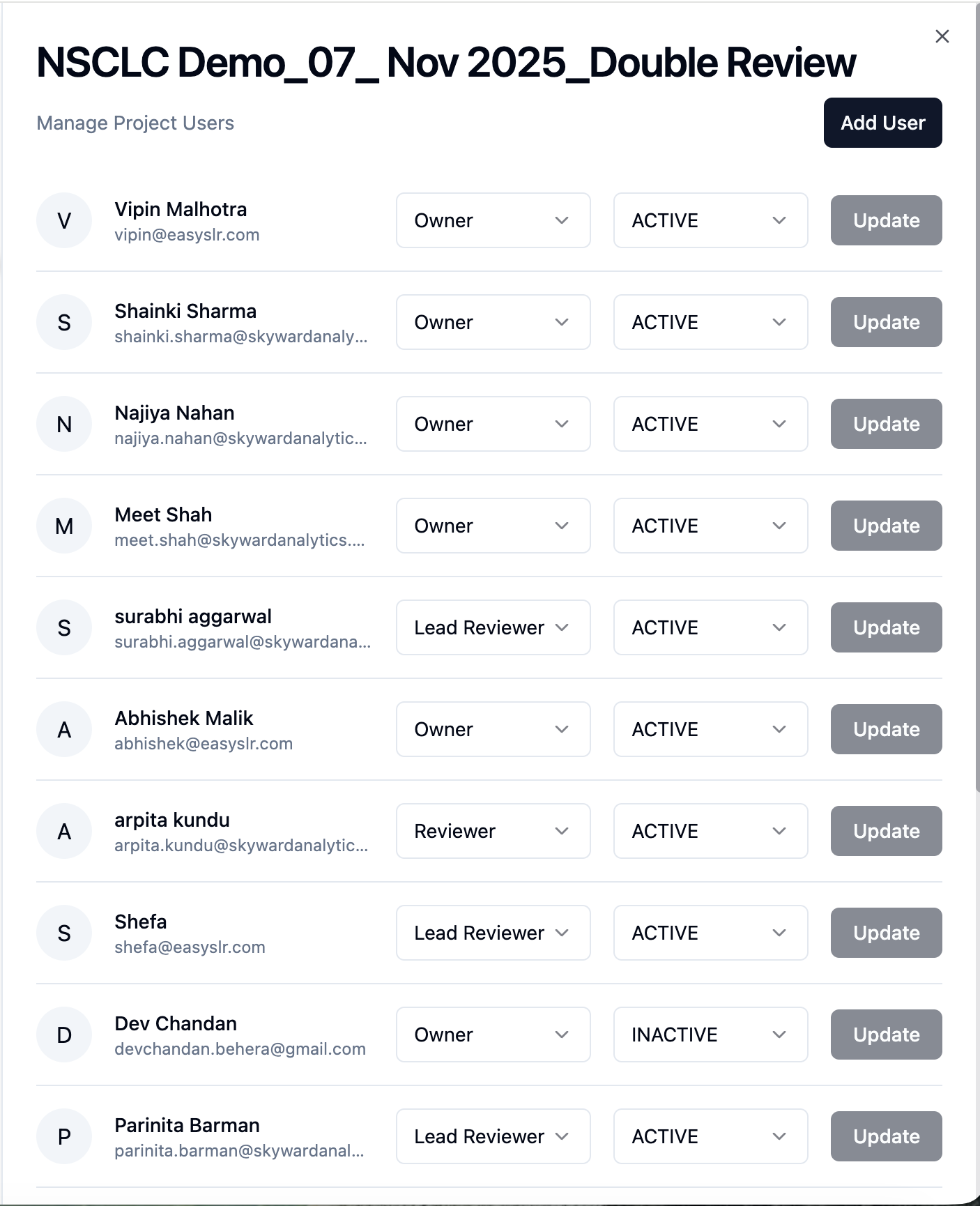
Complements Existing AI Selection Options
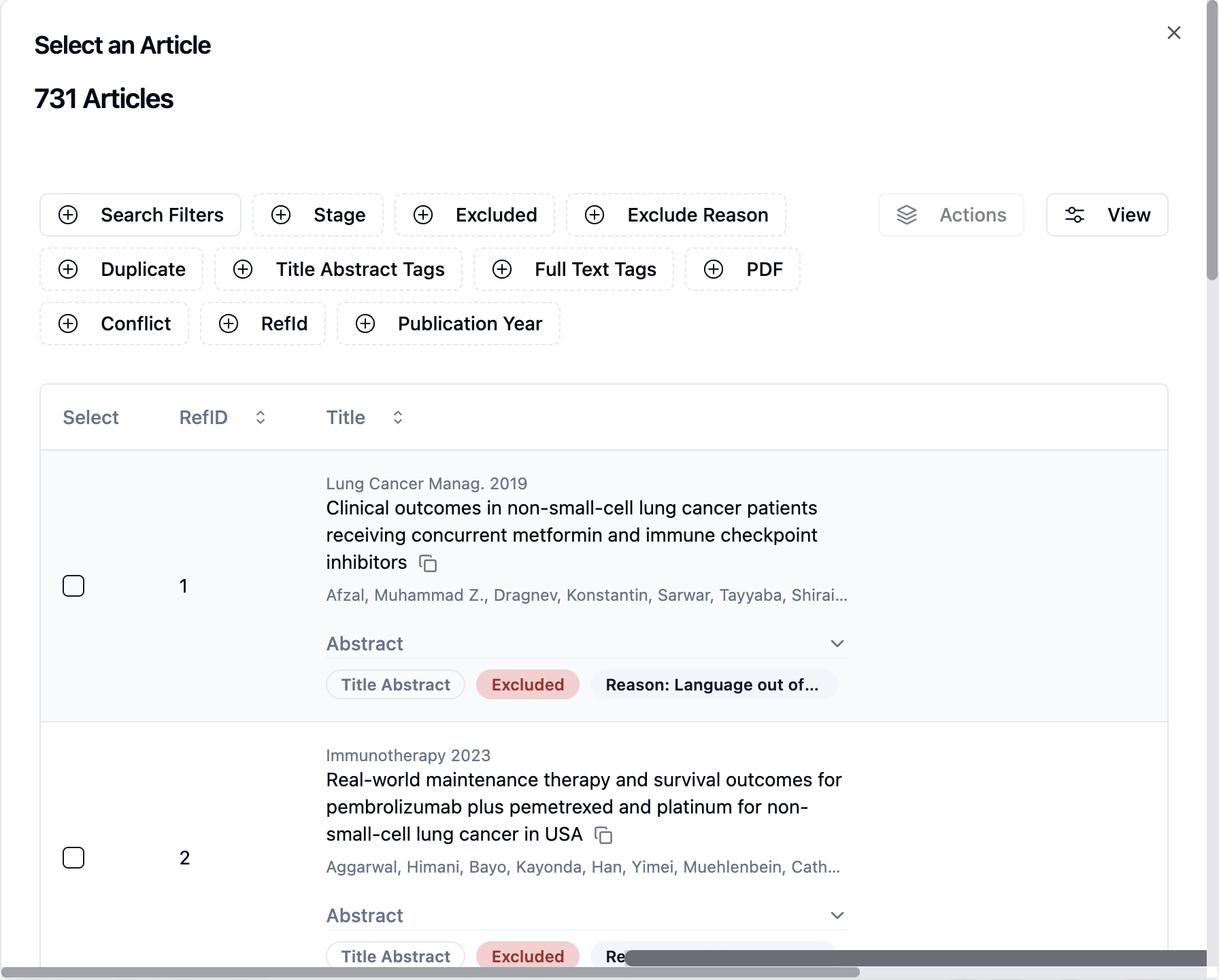
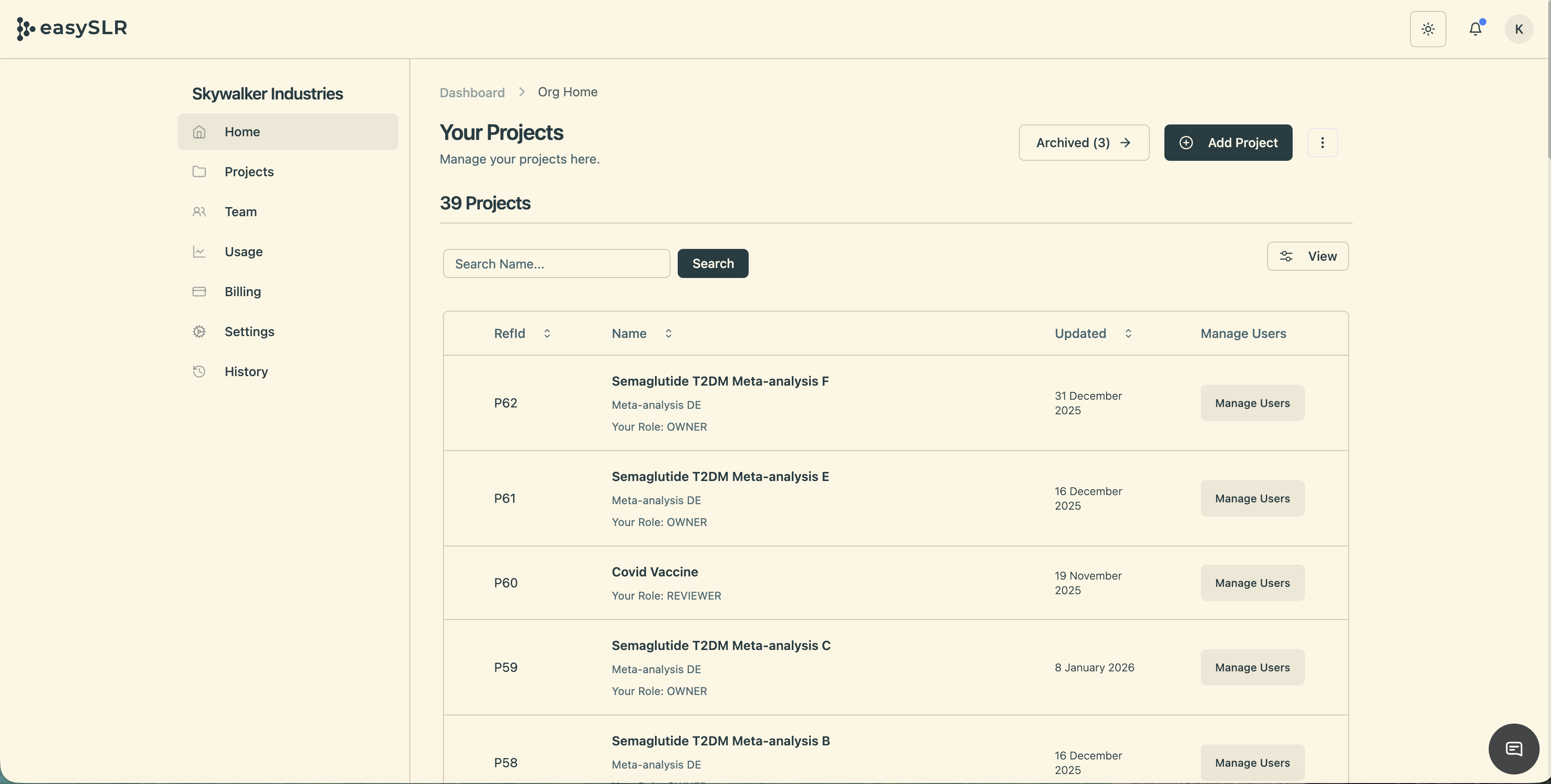
The new Articles in Conflict option has been added alongside the existing options available for bulk AI rerun.
This provides greater flexibility by allowing users to target AI processing based on specific workflow needs rather than rerunning AI across a broader set of records.
Key Benefits
Faster Conflict Resolution with AI: Quickly rerun AI on articles in conflict, with support for multiple AI iterations to help reduce conflicts and reach consensus more efficiently.
Reduced Manual Effort: Eliminate the need to manually identify and select articles before rerunning AI.
More Efficient AI Usage: Focus AI processing on articles where it is most valuable, improving review efficiency while avoiding unnecessary AI execution on already resolved records.
Summary
The new Run AI on Articles in Conflict enhancement makes conflict resolution more targeted and efficient.
By adding Articles in Conflict as an additional bulk AI rerun option, EasySLR enables review teams to quickly obtain AI recommendations for unresolved conflicts, helping accelerate consensus decisions while improving the overall efficiency of the evidence synthesis workflow.