Revamped Sidebar – Optimized Screen Space & Cleaner Interface
We’ve redesigned the EasySLR sidebar to make better use of available screen space and create a cleaner, more efficient workflow experience.
The updated layout removes unnecessary empty spaces across the interface, allowing users to utilize more of the screen for actual review activities such as screening, PDF review, and data extraction.
What’s Improved?
Better Utilisation of Screen Space
The interface has been optimised to eliminate unused and unnecessary empty areas, ensuring that more content is visible on the screen at all times.
Key Enhancements
Adjustable Sidebar Size
Users can now resize the sidebar based on their preference and workflow needs.
This allows teams to:
Expand workspace visibility while reviewing articles
Customise the layout according to screen size and workflow stage
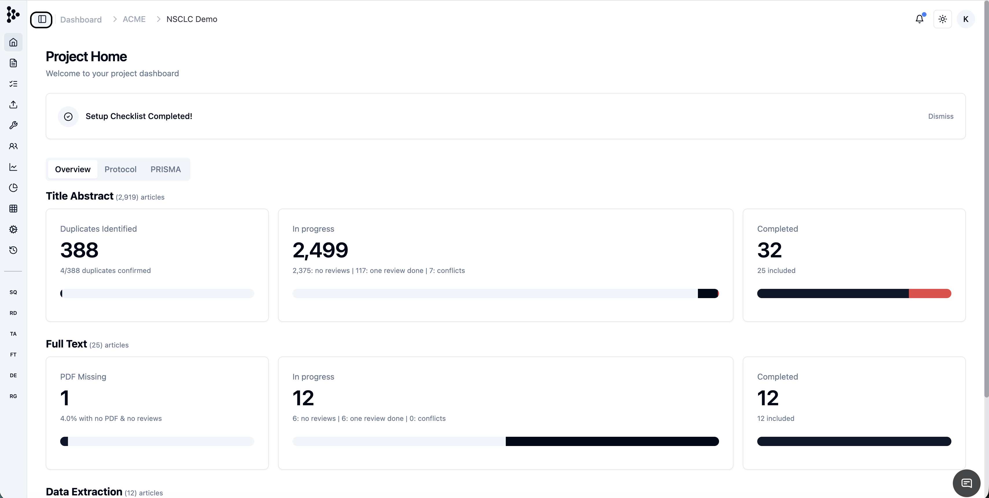
Cleaner & More Compact Navigation
Navigation sections have been reorganised to reduce clutter while keeping all major workflow stages easily accessible.
Users can quickly move between:
Search & Import
Screening
Full-Text Review
Data Extraction
Quality Appraisal
Statistics & Reports
Project Settings
without large unused gaps or excessive spacing.
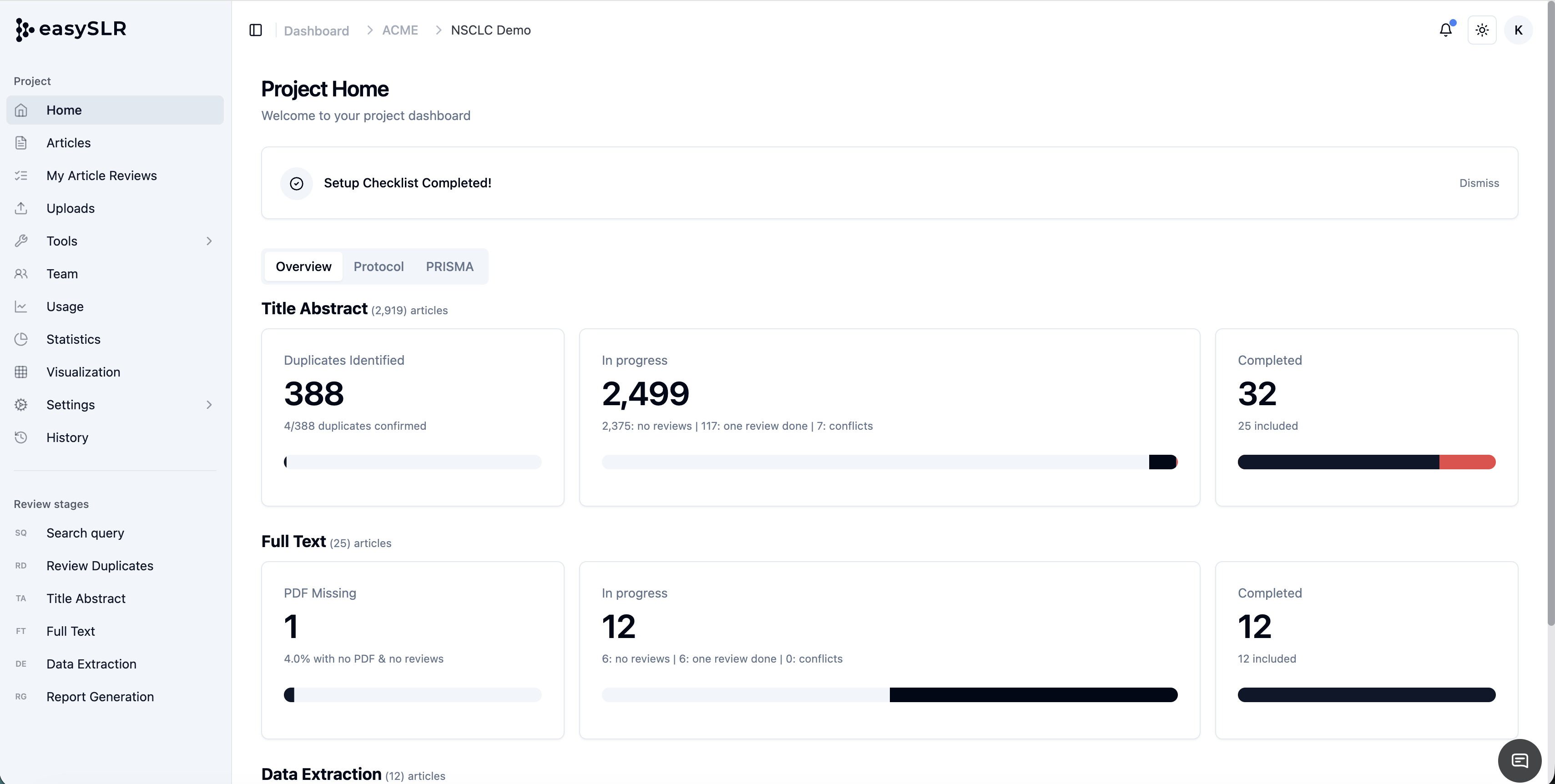
More Workspace for Core Review Activities
This is especially beneficial for teams working on laptops or smaller screens
Reduced Visual Clutter
The redesigned structure creates a cleaner interface with:
Better spacing consistency
Improved alignment
More efficient content organisation
Fewer distractions during long review sessions
Improved Experience Across Devices
The optimised layout improves usability across:
Laptops
Smaller monitors
Split-screen workflows
High-volume evidence synthesis projects
while making better use of every available part of the screen.